
I’m guessing that most Americans don’t pay attention to the Air Quality Index (AQI) on a regular basis. That is, not until recently when they’re either dealing with or reading about the dangerous fumes in Los Angeles because of the fires.
According to the Environmental Protection Agency, which manages this site, the AQI tells users how clean or polluted the air is, and what associated health effects might be a concern. “The AQI focuses on health affects you may experience within a few hours or days after breathing polluted air.”
 The EPA suggests users should “think of the AQI as a yardstick that runs from 0 to 500. The higher the AQI value, the greater the level of air pollution and the greater the health concern. For example, an AQI value of 50 represents good air quality with little potential to affect public health, while an AQI value over 300 represents hazardous air quality.”
They go on to say that the “AQI values below 100 are generally thought of as satisfactory. When AQI values are above 100, air quality is considered to be unhealthy at first for certain sensitive groups of people, then for everyone as AQI values get higher.”
I often check the weather.com app before I pack for a trip to see the extended forecast and to find out things like what time sunset and sunrise are and the wind speeds the morning of my flight to see if it’s going to be bumpy or not.
Rarely have I ever looked at the Air Quality Index in the bottom right-hand corner. But that changed a few years ago when air quality levels where I live have became unhealthy because of forest fires and even worse in other destinations.
For example, in 2020, when I first started learning about AQI, my eyes almost popped out when I read Portland Oregon’s AQI was 493 (see screenshot from my Tweet). As I wrote back then, “unfortunately, times are changing; the climate crisis is getting worse and forest fires have steadily increased in their strength.”
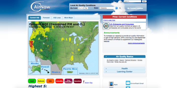
The EPA’s site isn’t very pleasing to the eye so I recommend checking out AirNow.gov, which I believe is the same data and also run by the government. Keep in mind it just provides information for the USA.
There are multiple websites and apps that offer air quality readings and that are not limited to just the USA but the whole world. The information doesn’t always seem to be the same so I asked my buddy and tech guru, Leo Laporte, which is the most accurate one and he said he uses PurpleAir.
PurpleAir
PurpleAir doesn’t have an app but they do have an easy-to-use map powered by Google Maps. According to their site, they use “PMS5003 and PMS1003 laser particle counters. These sensors count suspended particles in sizes of 0.3, 0.5, 1.0, 2.5, 5.0, and 10um. These particle counts are processed by the sensor using a complex algorithm to calculate the PM1.0, PM2.5, and PM10 mass concentration in ug/m3. PMS5003 and PMS1003 sensors come factory calibrated.” I have no idea what that means either but I assume it’s important, which is why I’m including it.
They do go on to state that “before deploying any devices, we verify that they are giving out readings that are consistent from sensor to sensor during tests in a smoke chamber. So far, all sensors we tested have produced consistent output.”
Air Pollution: Real-time Air Quality Index Visual Map
Another site I recommend for world travel is the World Air Quality Index project. They offer it in a dozen languages and you can search by region (Asia, Europe, North America, South America, Africa, Australia, Middle East, India, China, Japan, South Korea, Thailand, Mexico) or by clicking this link for where you’re located.
Oh Canada
For those who are only interested in Canada, check out FireSmoke.ca.
Air Visual by IQ Air
The app I have downloaded on my iPhone is Air Visual by IQ Air. It’s billed as the “#1 air quality app,” free, available on all platforms, is the easiest to use and the visually appealing. Personally, I like it and find it easy to use.
Plume Labs: Air Quality App
Another highly rated app is by Plume Labs called Air Quality App. It’s free, global and provides a live view of what your city is exposed to. “Plume Labs displays real-time indexes and concentrations of PM2.5, PM10, NO2 and O3.”
One thing that’s for certain is that air quality is something travelers should be looking up when planning a vacation or just before arriving in a new destination. In some extreme cases, like this week on the west coast, it would probably be best to postpone your trip.
Thanks Johnny for the info on the Air Quality App. I have an Android and downloaded the AQI (Air Quality Index). If there is a better one for Android please let me know.
Thanks
Pardon my grammar error. I forgot to reread!
Hello, Johnny, Thank you for addressing air quality but I would like to know if there are websites that show seasonal pollen counts for various cities in Europe and Asia. I have been unsuccessful in trying to find the year round data for foreign countries in those continents. (Perhaps, it is because I don’t know the various language terminology for “Pollen Count”.) I believe that a lot of people have allergies. Personally, I don’t like having to have to take antihistamines for my entire vacation stay. I know that the coasts for oceans are usually good but what about going to Nice, France, for instance. Does the weather bring high pollen from Africa? Thank you!